
Odyssey by UPMC
Lead Designer
Schell Games, 2017

-
iOS (Delisted)
-
Android (Delisted)
Overview
-
Odyssey is a healthcare workbook made for your phone, as part of Schell Game's transformational game development. As Lead Designer I set the creative vision for the project - overarching design decisions, leading brainstorms, aligning the team, setting quality standards, and communicating the design with the client. The main goal of the project was to translate existing paper workbooks into a highly interactive mobile app, by utilizing the principles of game design.
Contributions
-
Making Reading Fun
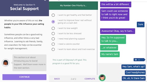
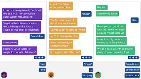
Workbooks, by their nature, involve lots and lots (and lots) of reading. Design challenge #1 was to make reading as engaging and enjoyable as possible - this was our main mechanic! The solution was to have a variety of tools for displaying content: chat conversations, long form articles, quizzes, and even micro-games. Chats increased engagement and provided player agency, while articles provided quick, helpful reference material.
-
Character Counts
Characters were introduced into the app to make the information more relatable and accessible. We used a range of character types based on each section's needs: "coaches" provided official instruction and encouragement, "veterans" had completed the program and provided relatable anecdotes, and "newcomers" gave players the chance to teach and model what they had learned.
-
More Than Software
Healthcare apps come with the baggage of hard-to-use software. To overcome this, our mission was to make the app immediate and special in order to surprise and delight users. This required our content exact and to the point, providing users with useful, actionable information. And because behavior change is hard work, we over celebrate any accomplishment - like cutting a ribbon when completing a section.
Notes
-
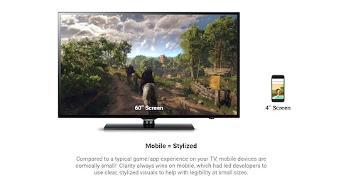
Because Odyssey lives on phones, it was essential to make the experience mobile-first. This involved using common mobile game metaphors like maps and levels to ease users into the app. It was also important for the design to emphasize visual clarity and readability for small screens and hard of sight users.
-
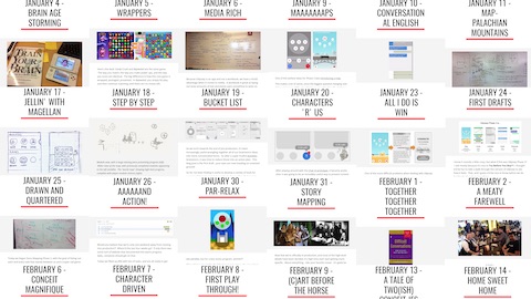
Throughout the project I kept an internal development blog for the team. This was a great way to communicate the project vision, update the team (and studio) on daily progress, and create a document of the project's process and evolution. I frequently encourage other team members to write guests posts, so that everyone had a chance to share their voice and work.